bystphie logo gif
By clicking “Accept”, you agree to the storing of cookies on your device to enhance site navigation, analyze site usage, and assist in my marketing efforts. View my privacy policy below for more information.Privacy Policy
Back

Fresh and Fruity

Fresh and Fruity is a greengrocer located in Preston, Lancashire that prides itself on providing customers with high-quality, locally sourced fruits and vegetables. The following is a branding case study that covers how Fresh and Fruity can convey its values to potential customers.
The goal was to create a friendly, colourful identity and highlight the brand's grass-roots. The brand's values lie in high quality, local produce and providing a personal and reputable service to its customers.

fresh and fruity logo cover with fruit and vegetable illustrations
fresh and fruity horizontal logo variationfresh and fruity circular logo variation
fresh and fruity logo explained

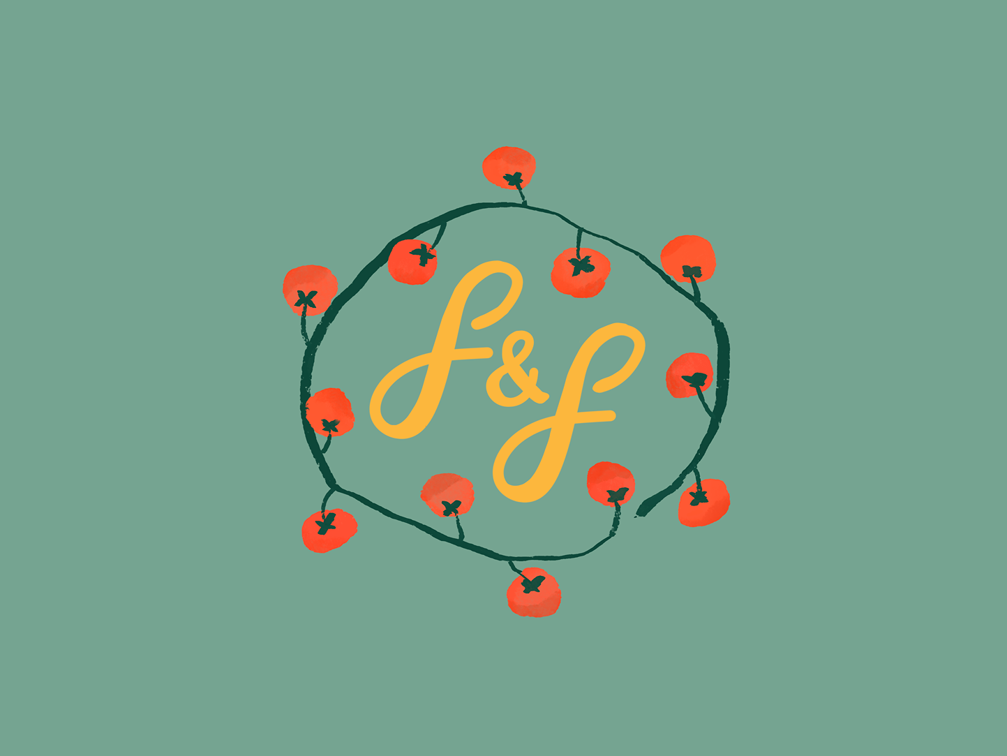
I chose to create a design that feels personal by using a handwritten style and natural colours that symbolise fruits and vegetables. The use of organic shapes and a hand-drawn illustration reinforces this style. I also used extended letters to symbolize growth and intertwined letters to symbolize connection and community.

Icons / Illustrations

fresh and fruity illustration of swede turnipfresh and fruity illustration of chard
fresh and fruity illustration of cherry tomatoes on the vinefresh and fruity illustration of an orange satsuma fresh and fruity illustration of a button mushroomfresh and fruity illustration of a carrot

Mockup Gallery

Tools Used

procreate iconphotoshop iconillustrator icon
Back

Like what you see?

Get in Touch