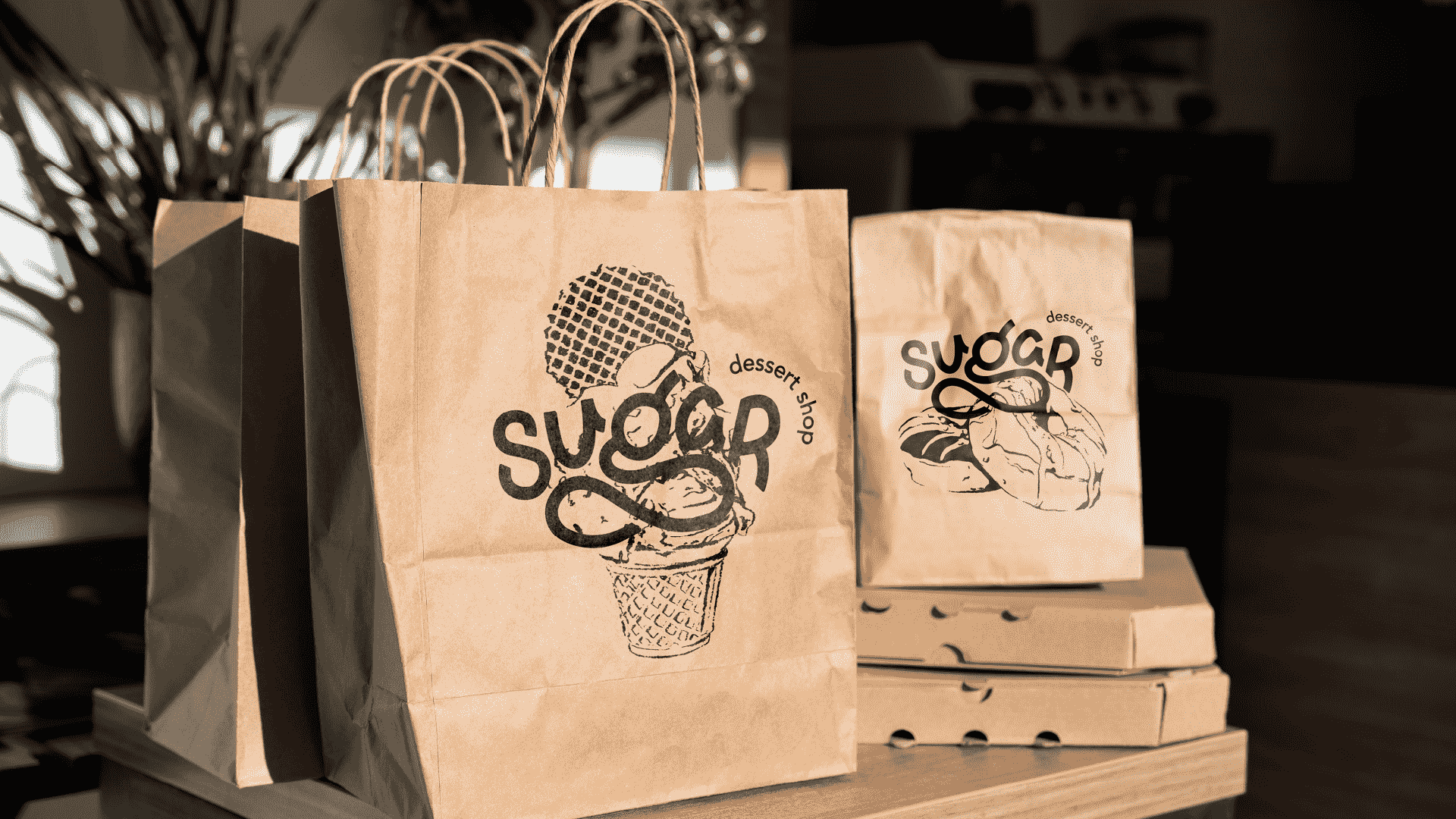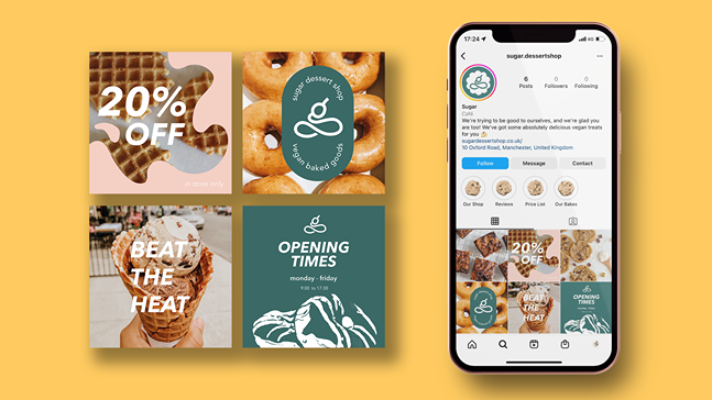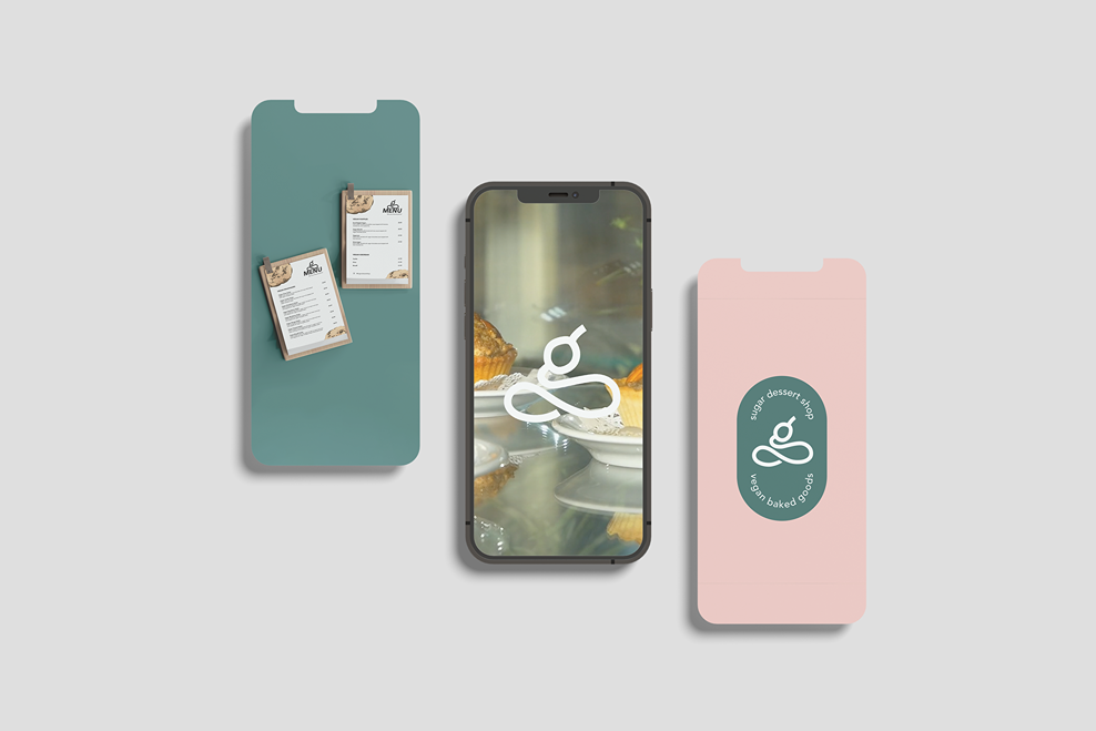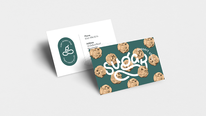

By creating a vibrant and playful brand identity, Sugar can differentiate itself from other dessert shops and break down the stigma of plant-based food being boring or tasteless. By emphasizing the fun and indulgent side of desserts, Sugar can attract a wider audience and establish itself as a go-to destination for delicious desserts.
This brand is playful, funny, loud, and positive. They prioritise, animal rights, sustainability, and ethical sourcing while still offering delicious desserts.
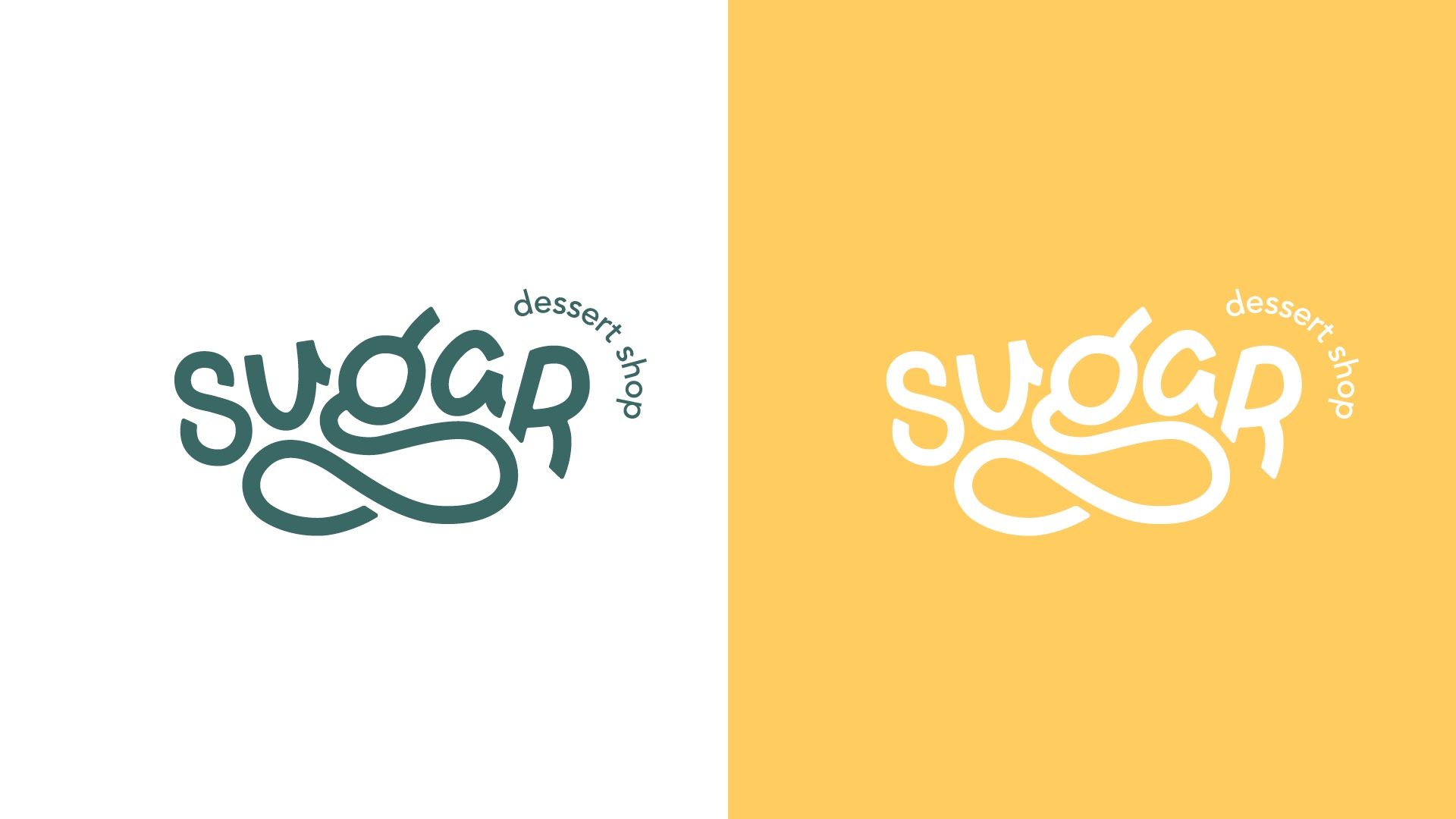

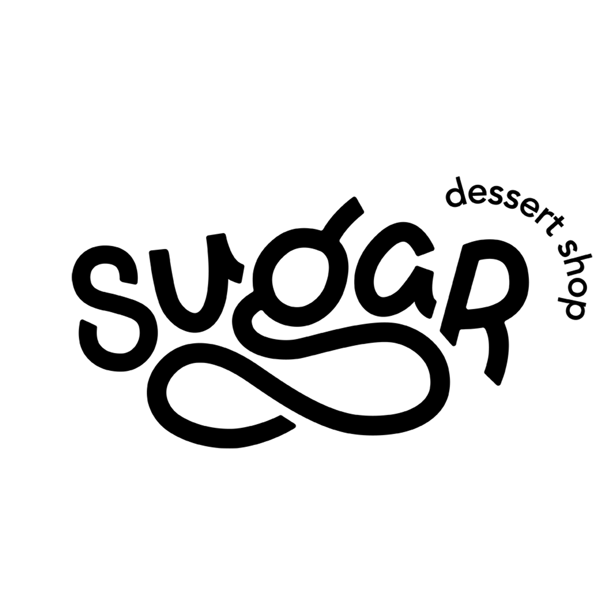
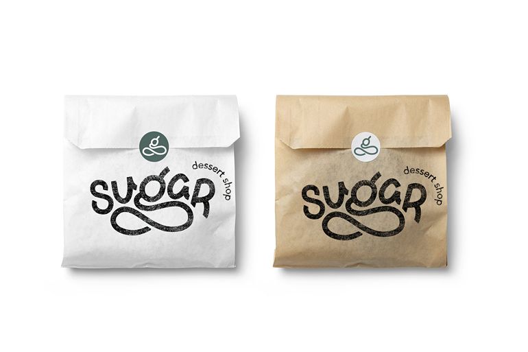
I wanted this brand to incorporate iconography in the form of the cherry on top, adding to its fun and playful aesthetic. I manipulated the shape of the "g" into the icon for the sub logo. The brand utilizes vibrant, dessert inspired colour scheme, which adds to its playful personality. In terms of typography, the brand uses a modern and clean sans-serif font that emphasizes simplicity and minimalism.
